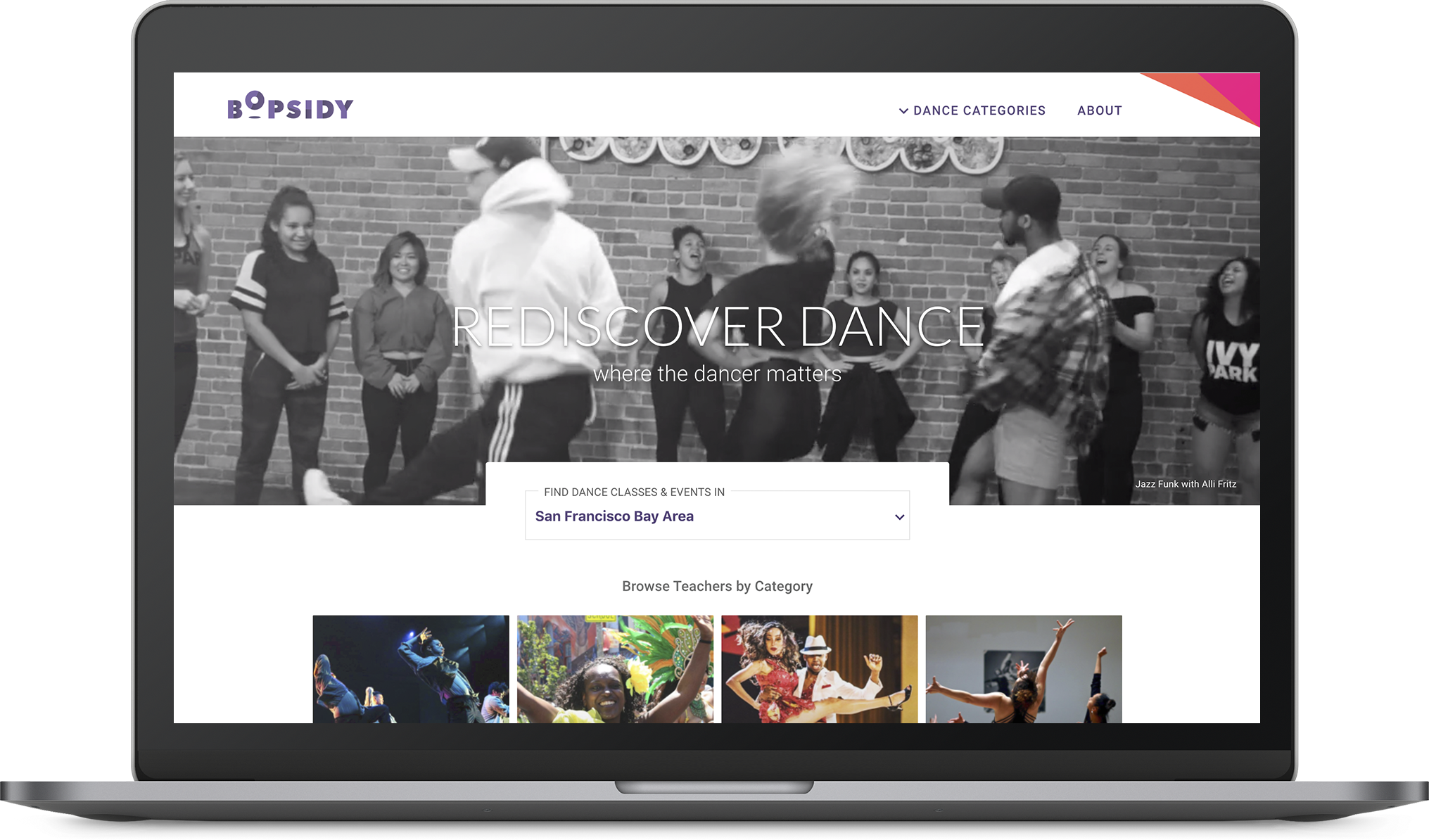
Bopsidy
Case Study: UX Design - Search Functionality
Bopsidy: Looking for the perfect beat
Project Brief
“Bopsidy is where dancers connect.” Their mission is to “build a connected community of dance hobbyists and professionals, inspiring all to pursue and share their love of dance.” Still in its early stages of existence, and serving just the SF Bay Area for now, Bopsidy’s current focus is to connect dancers with instructors and their classes. This is done through a crowd-sourcing model where anyone can create a profile for themselves or a teacher.
As a UX designer within a small team, my role was to explore a search bar experience from homepage to search results. Opportunities to improve the UI and visual design of the homepage were also explored. Key elements required by business were:
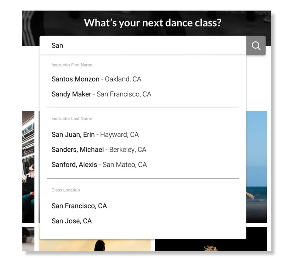
“Typeahead” feature
Search instructor by name
Research
Personas

Mid-Level Megan (Largest user group)
Age Range: 18-35
Dance Skill: Intermediate - Intermediate / Advanced
Originally started dancing for social networking and fun. Continues taking classes into early adulthood, as dancing continues to be a serious hobby for her.
Preferences: The instructor must be passionate. Their dance style and music choice must resonate with her.
Dislikes: When instructors are too critical or condescending.
““I want to take a Hip-Hop style class, what are all my options?””

Experienced Alfred
Age Range: 18-35
Dance Skill: Advanced
Most likely introduced to traditional dance styles (Ballet, Ballroom, Jazz) at a young age. He takes classes to stay interactive with dance and sharpen his skills. He also auditions for dance groups and shows.
Preferences: An instructor must a have great reputation. Their music selections are important as well. The skill level of the class is a deciding factor.
Dislikes: When instructors are too critical or condescending.
““I’ve heard of this instructor before, do I want to take a class from them?””

Social Sally
Age Range: 35-55
Dance Skill: Beginner
She takes social and aerobic style dance classes (Zumba, Ballroom, etc.) casually for exercise, fun and socializing. Most of the time she’ll take these classes with her friends.
““I want to know what class is like before I come.””
Usability Testing

I conducted a usability test to assess pain points with the current teacher search flow (homepage > results page > teacher info page). I tested 3 users, and gave them the following 2 prompts:
Homepage: “Search for a dance class you’d be interested in taking.”
Results Page: “Search for a class which is at an intermediate level.”

Homepage, Search Results and Instructor Profile page.
Test Insights:
Filters weren’t used or noticed at all by 2 of 3 users.
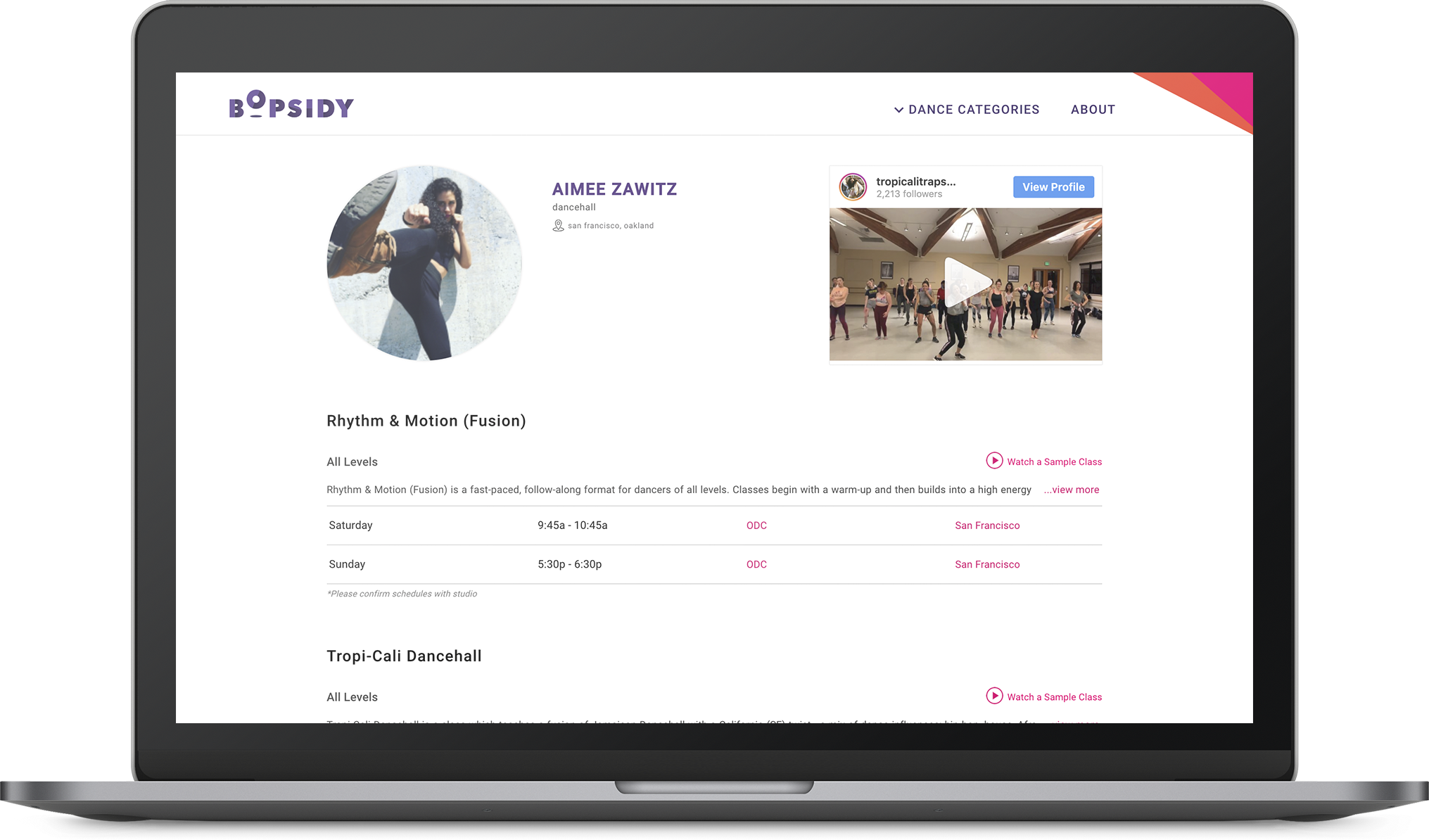
Users relied heavily on instructor/class descriptions and choreography videos. They were more likely to choose an instructor that had these elements in their profile page, especially videos. Clicking into a profile that lacked this information resulted in less interest in the instructor.
Class times were important.
Key Findings

In considering all the persona and test data, I had grouped the insights into 3 categories.
Music: Music selection of the instructor is key.
Teaching Style: Nobody likes a condescending instructor. The instructor’s credibility and reputation are most important.
Class Details: Details in regards to time, location, and skill level are critical as well.
Competitive Research
There doesn’t seem to be any direct competitors online that are aggregating class and instructor info in a single place like Bopsidy. Typically, class listings are managed by the dance studios that hold the classes, so multiple websites usually have to be visited to do an extensive class search. Dancers also rely on their personal network to find classes by word of mouth. I took a look at a few indirect competitors online to compare the search experience.

The most popular entry-point for any kind of research. Results typically were websites of dance studios and dance blogs.

A search for dance classes on Yelp yielded 400+ results, but the results weren’t always dance focused. Their use of filters is a good reference.
This site came up during a Google search. Basically you tell them your needs, and they search for a class for you. An email comes later with their results. Although an interesting concept, my email response came with zero results.
Design Approach
Key Design Objectives

Create Search Bar: Search by name and include “typeahead” functionality.

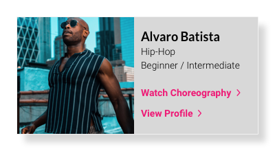
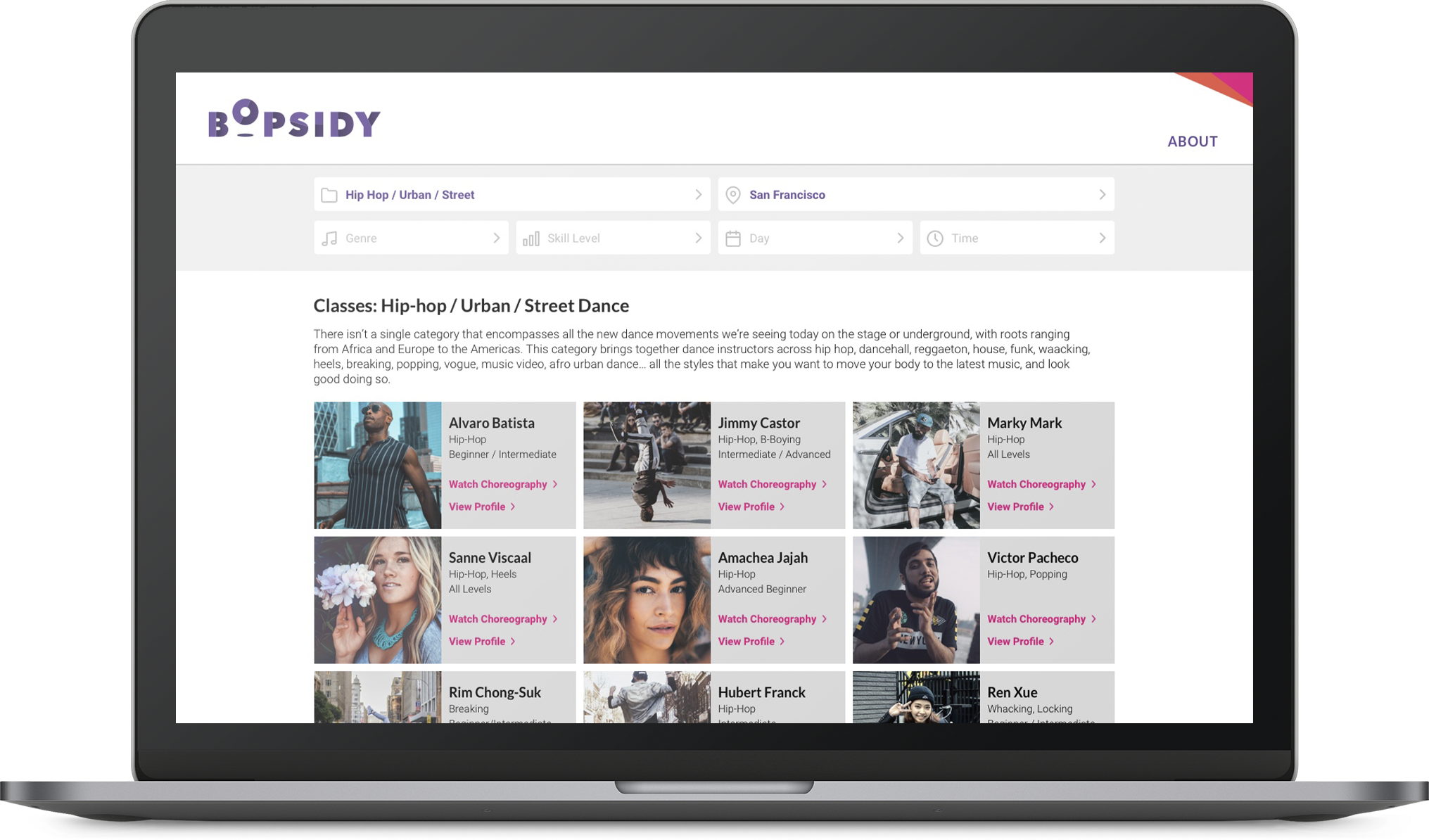
Enrich Thumbnail Information: I believe adding more relevant information for users in the thumbnail results page would help to relieve excessive clicking in and out of profile pages.

Elevate Search Filters: Make filters easier to find and more noticeable.
Search Bar
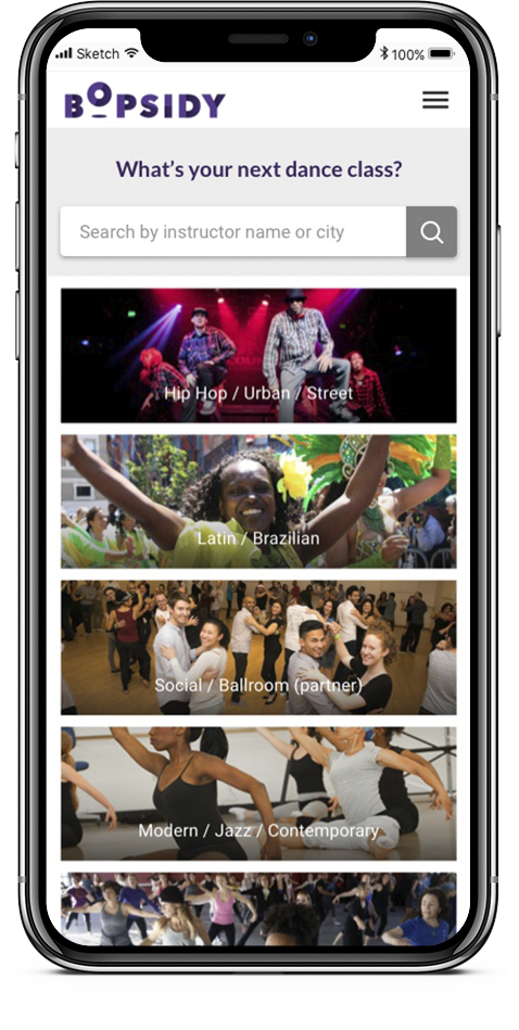
Version 1: Replacing the location filter with the search bar. Removing the location filter from the homepage gives the user a central focal point to engage with. A more extensive filtered search can be done in the search results.

Removed location filter

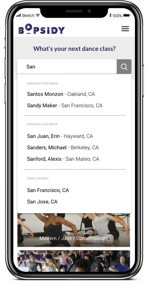
Version 2: Business had requested bringing the location filter back. This iteration combines locations and names in the search results. Instructions outlining how to use the search bar prompt the user.

Search bar instructions
Search Results
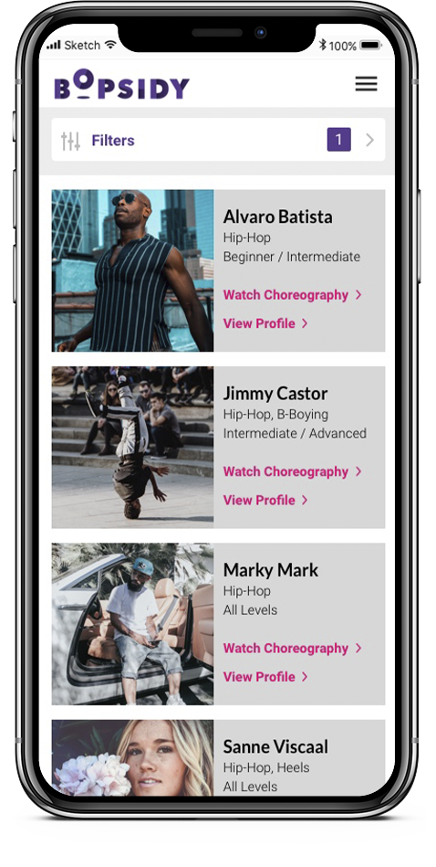
Per usability test insights, I determined that adding as much relevant information as possible to the search results, would help alleviate some pain points. By adding video links on the thumbnails, users will be able to glean both the instructor’s music taste and choreography style efficiently. Hopefully this will encourage them to click on the “View Profile” button to learn more.
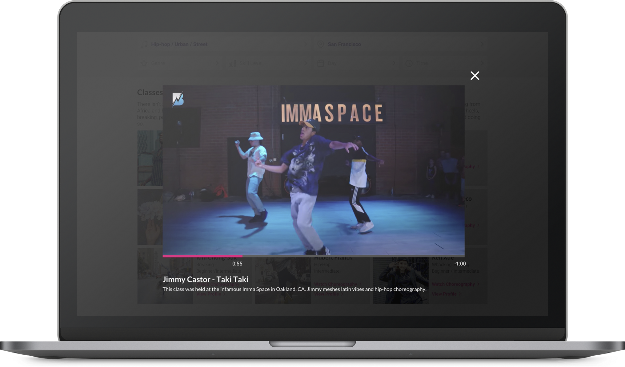
Video player modal
Filters
I had opted to move the filters from the left of the page to the top with the goal of:
Giving them higher visibility.
Reducing visual noise overall to give the search results a clearer visual hierarchy.

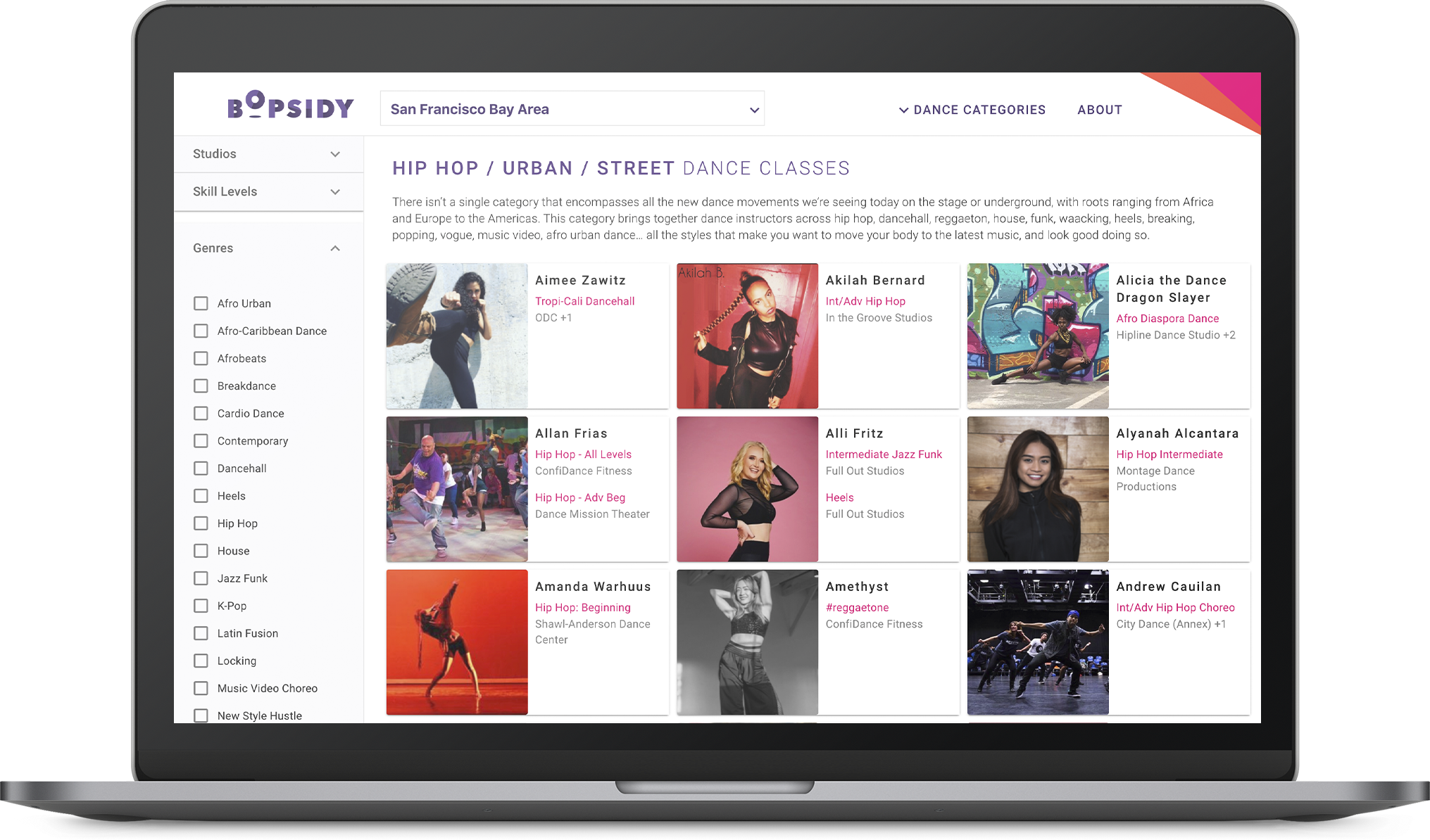
Revised design vs. Original version
Final Screens
Desktop

Mobile

Usability Test
A second usability test was conducted with the updated creative for both desktop and mobile versions. I had given the following prompts for the users:
Homepage: “Search for a hip-hop class in San Francisco.”
Results Page: “Search for a class at the intermediate level.”
Test Insights:
Users had consistently used the search bar as their first action.
Users consistently used the filters in each test.
Unfortunately I hadn’t created a target page for the “View Profile” button to link to. This had caused some problems with the test as it stunted the users flow.
Next Steps
Bopsidy has already implemented some of my suggested UI changes which were quicker to execute. My iteration of the search bar feature is still being considered alongside other competing versions. The company would like to do some internal testing before shipping a solution.
Looking forward, I’m hoping I can be involved in exploring more solutions to the search experience for Bopsidy. Some features that I feel would be exciting are:
Search by any keyword.
Map feature for studio locations.
Short teaching style highlights in thumbnails.